TrueLayer rebrand
I joined TrueLayer in 2019 to spearhead Visual Design in the Marketing team. I had the opportunity to work on all type of projects like illustration, data-visualisation, events & exhibition graphics, wayfinding, editorial design and branding. Being at TrueLayer helped shape my creative leadership profile by hiring and managing talent and also by facilitating workshops and mentoring new joiners.
TrueLayer works with some of the world’s largest fintechs, such as Revolut, Monzo, Nutmeg, Freetrade and Trading 212.
Task
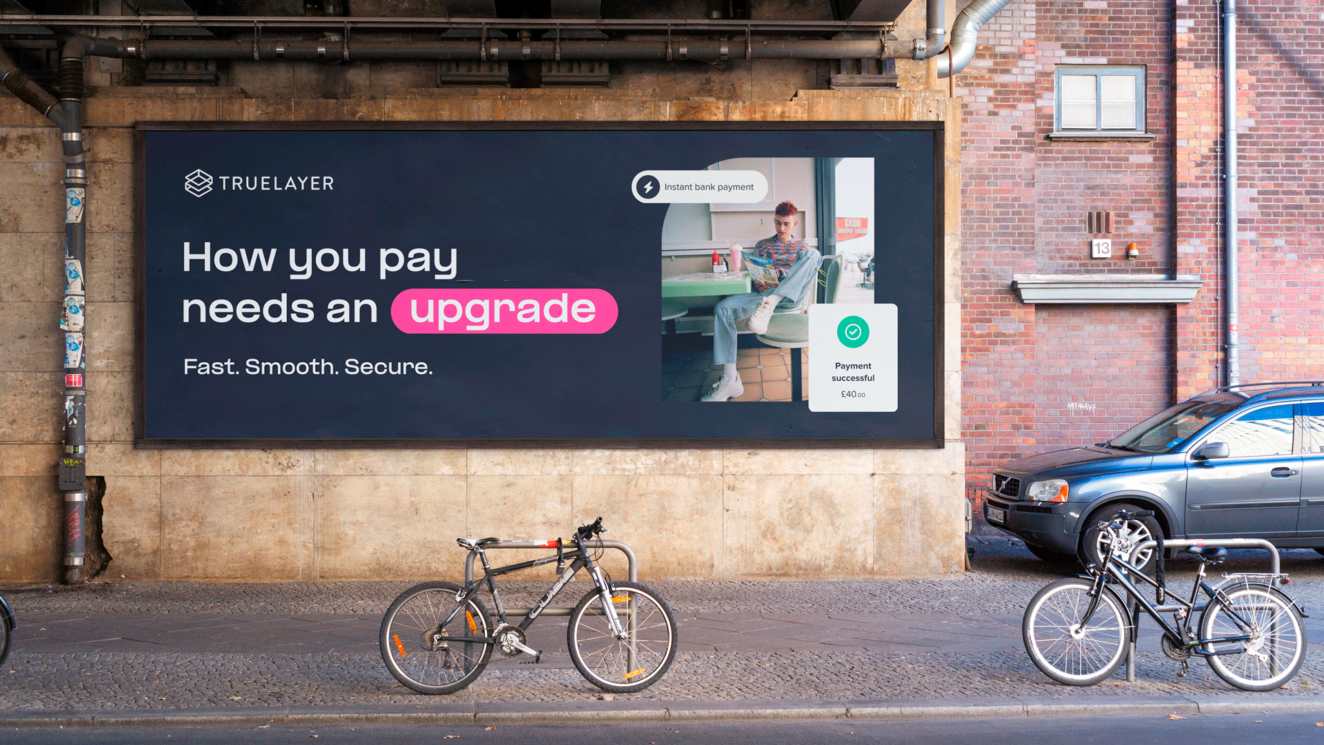
The goal of this re-branding project was to showcase TrueLayer’s transformation from a bank data connector to a global payments network provider that uses open banking to offer payment solutions. It also had to highlight how TrueLayer differs from its competitors, appeals to a diverse audience, and pursues its vision of changing the way the world pays.
Former branding was narrow and limiting, and did not reflect the diversity and potential of its clients and markets. Visually, it was static and rigid, and did not capture the dynamism and innovation of its mission and vision. It was not futuristic enough.
A brand that was similar and generic, and did not stand out from its competitors. Where blue meant finance and playing safe.
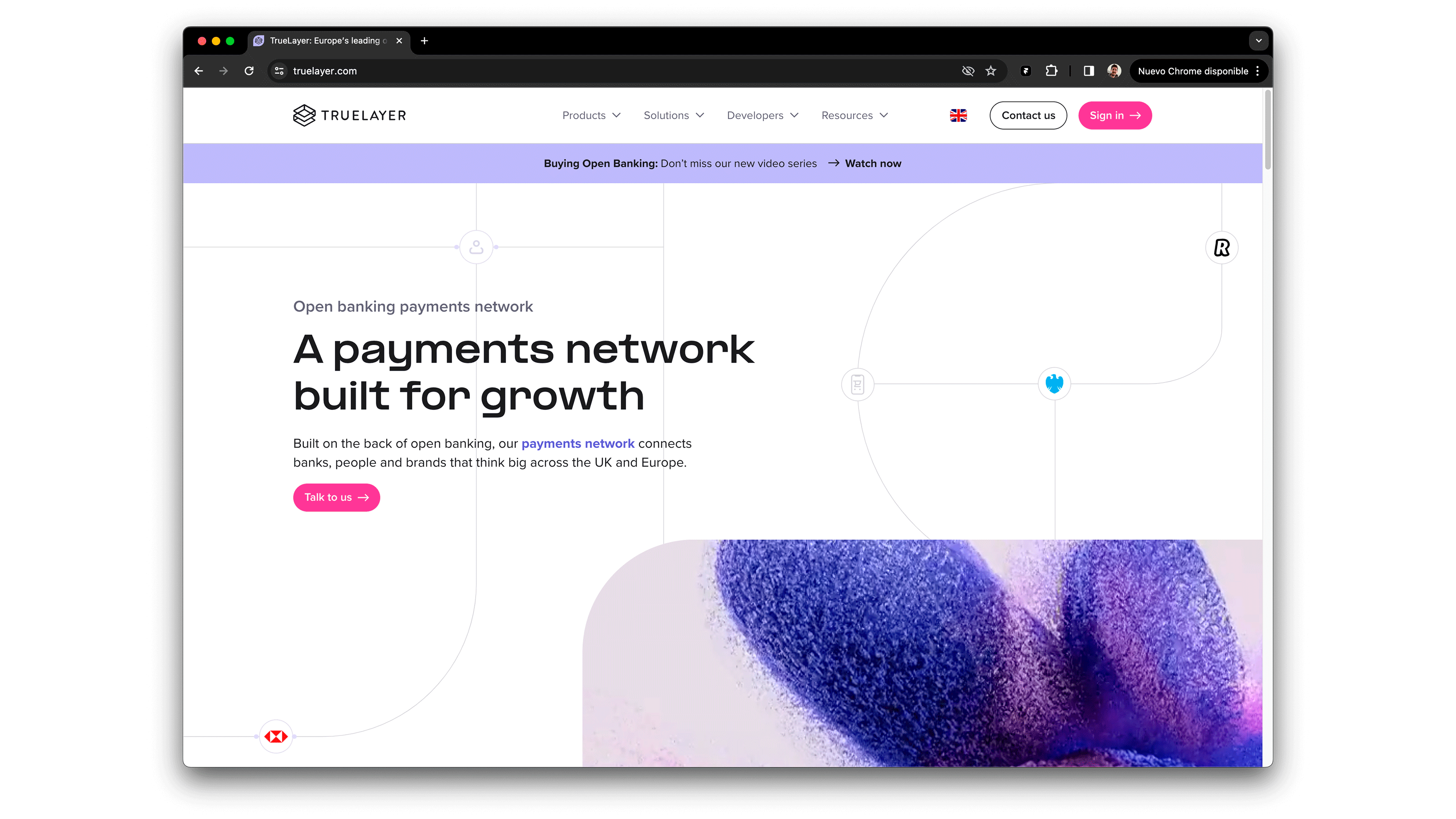
Below; how it looked before the rebrand.
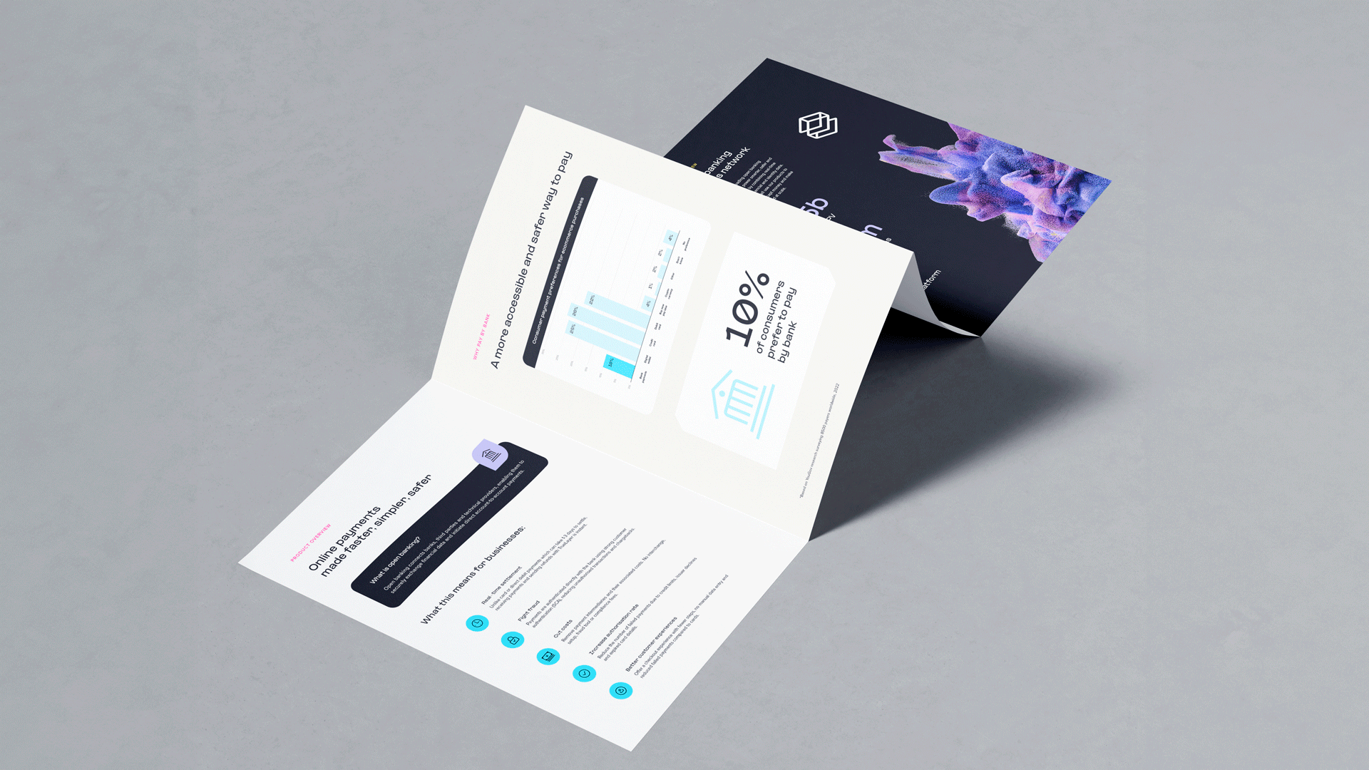
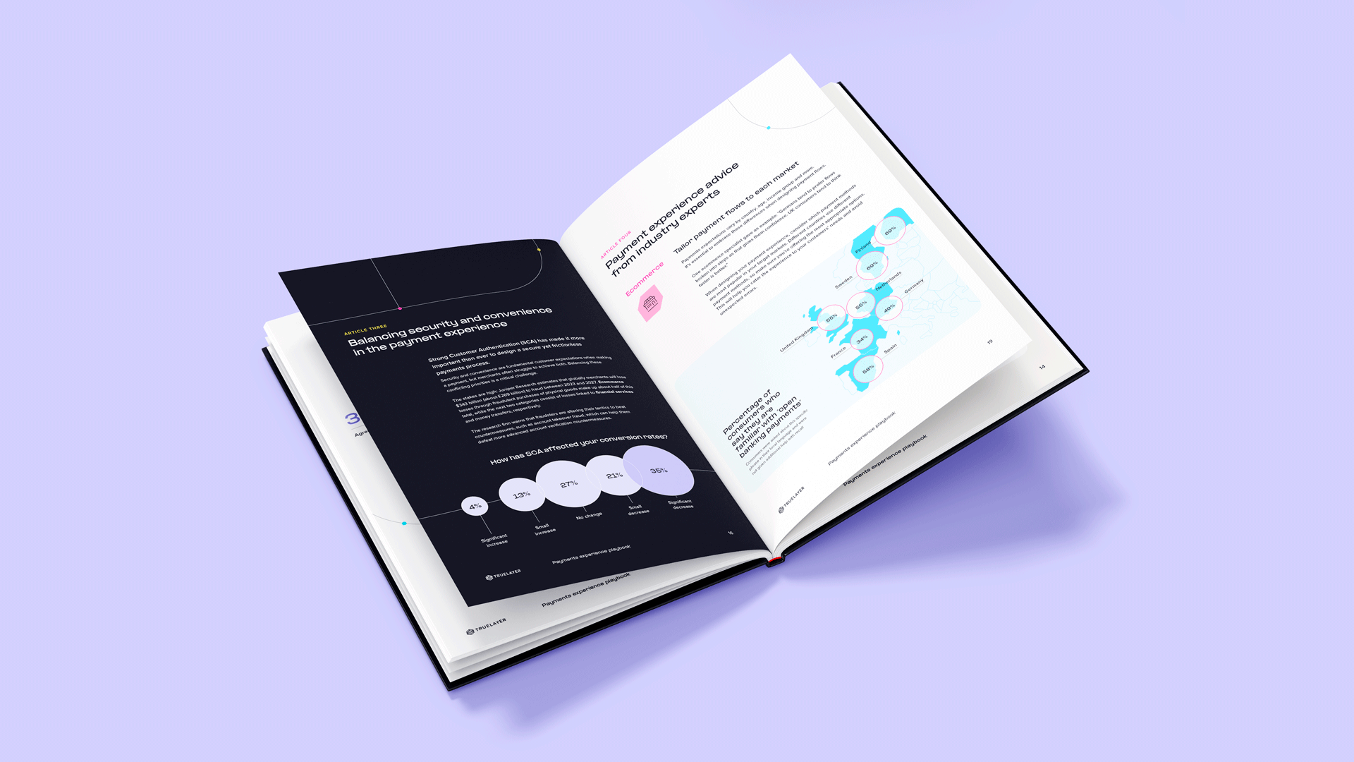
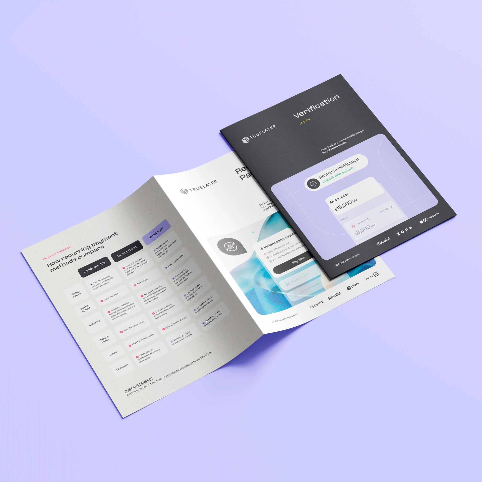
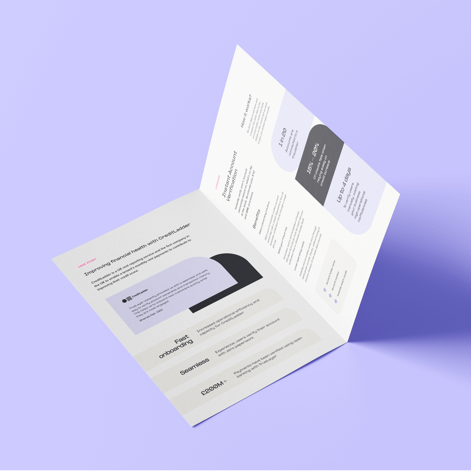
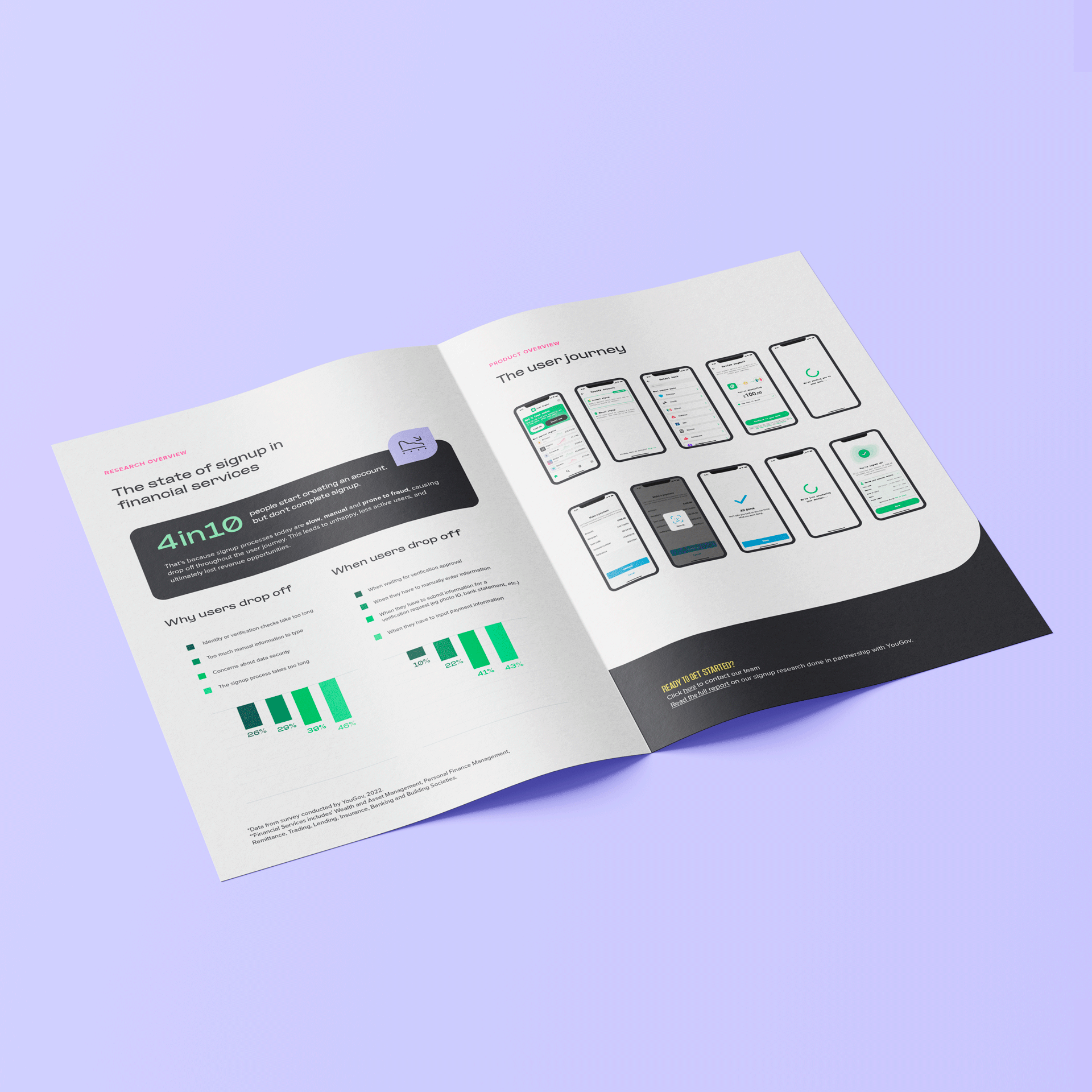
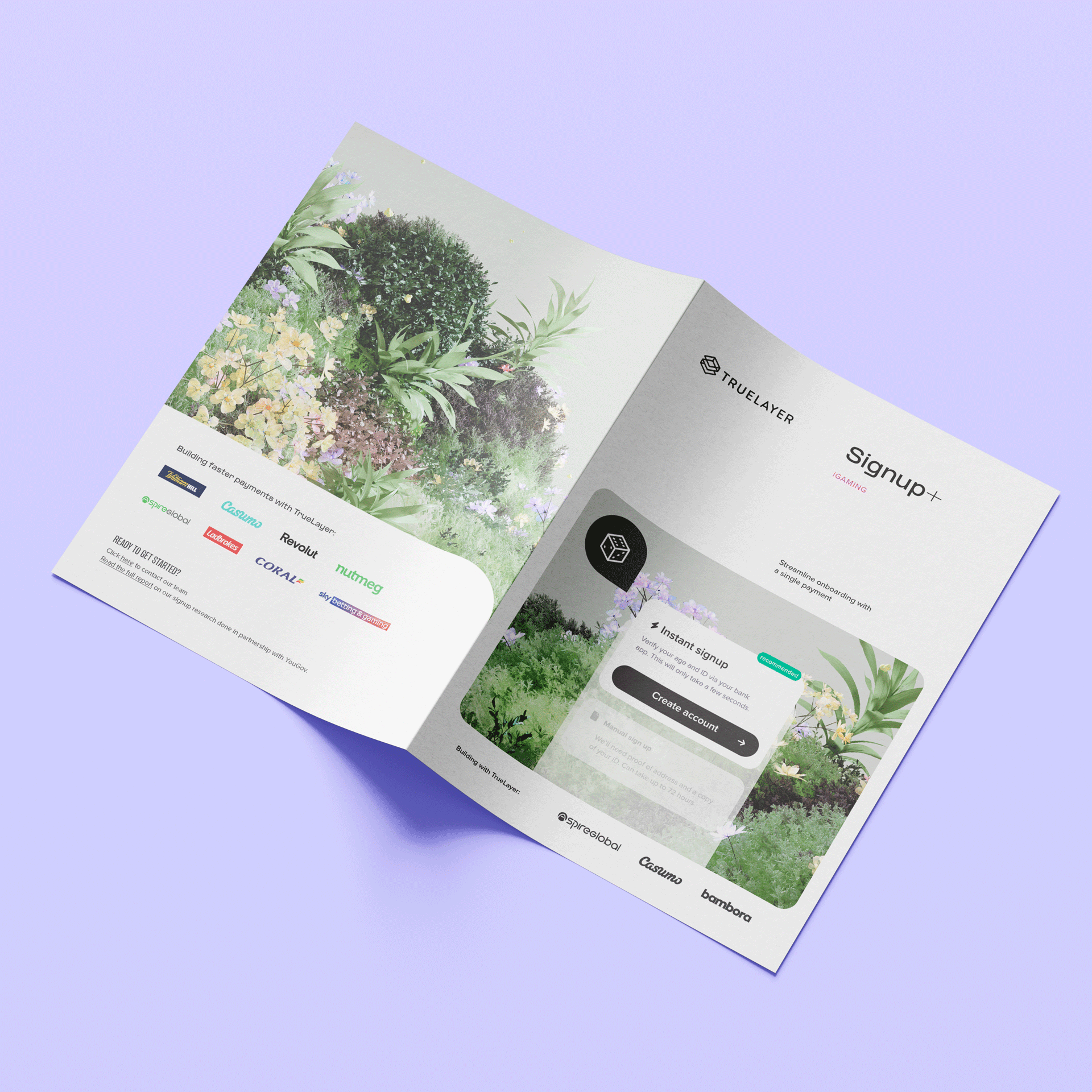
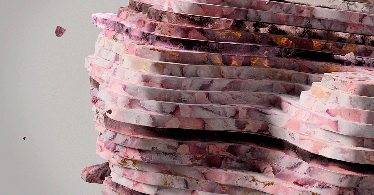
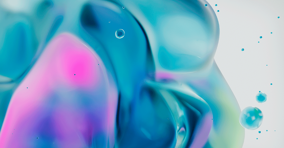
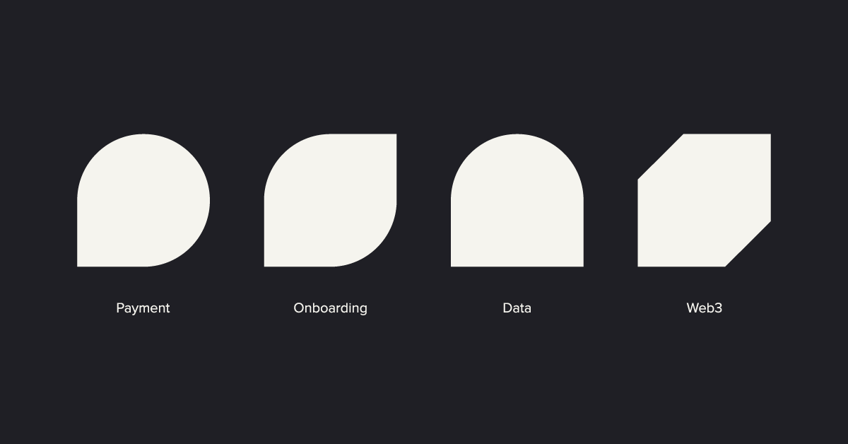
New graphic elements, which combine nature-inspired textures and Bauhaus shapes. Both tangible and evocative, and that illustrate the key elements of the business, such as flow, growth, infrastructure, and network.
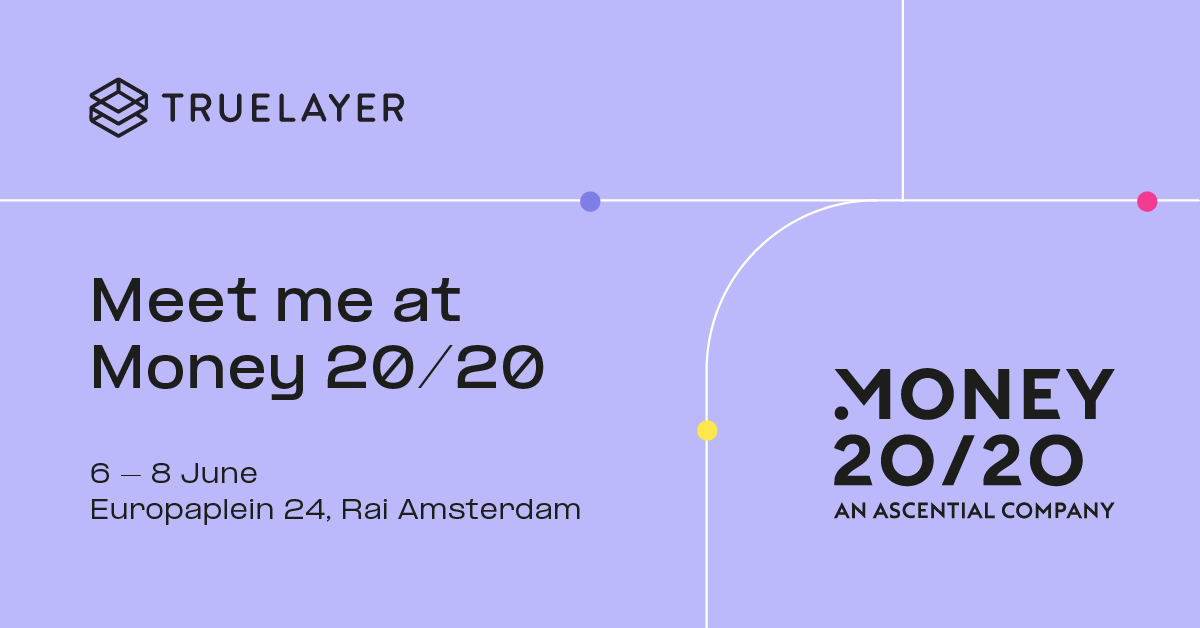
Tagline, “never before”, expresses the company’s ambition and attitude, and invites its customers to join its journey of discovery and innovation.
| Primary A #BBB9FB |
◯ |
|
| R 187 G 185 B 251 |
Lavender
| Primary B #1F1F25 |
◯ |
|
| R 31 G 31 B 37 |
Charcoal
| Accent A #FEE64D |
◯ |
|
| R 254 G 230 B 77 |
Yellow Sun
| Accent B #F33B92 |
◯ |
|
| R 243 G 159 B 146 |
Deep Pink
| Payments #73DEFF |
◯ |
|
| R 115 G 222 B 255 |
Liquid cyan
| Onboarding #9FEFAB |
◯ |
|
| R 159 G 239 B 171 |
Vegetation green
| Financial data #737DF9 |
◯ |
|
| R 115 G 125 B 249 |
Particles blue
| Crypto #F7BCFF |
◯ |
|
| R 247 G 188 B 255 |
Marble Pink
A color palette that features a vibrant and diverse range of hues, reflecting the richness of the network. It wasn’t an easy task, it took many weeks but the result was incredible.
Main typeface
Formula Extended
Usage
Headlines
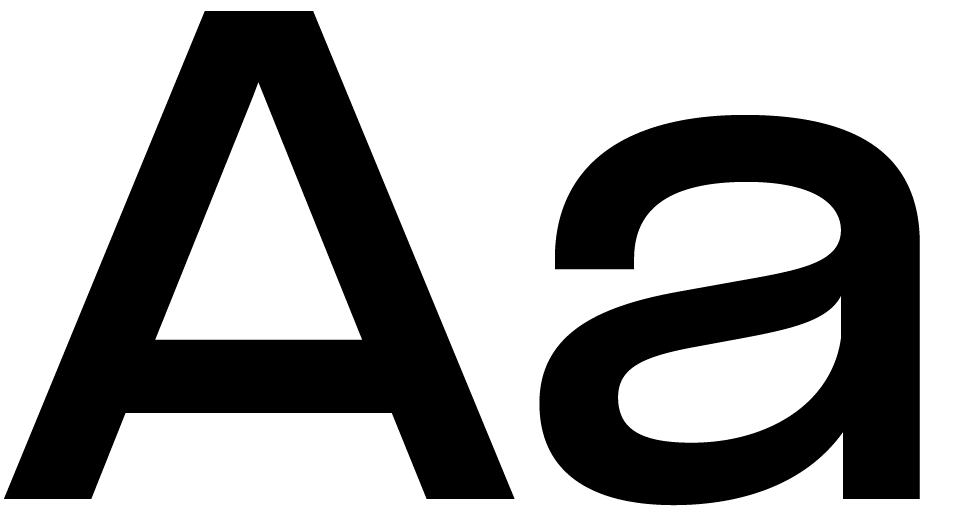
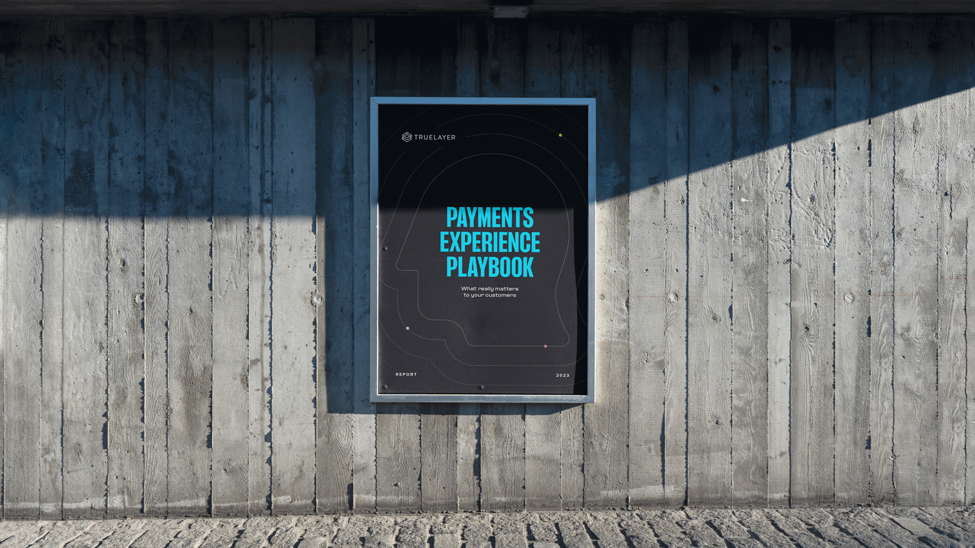
Modern and geometric sans-serif font, with variable weights, conveying a sense of future and innovation.
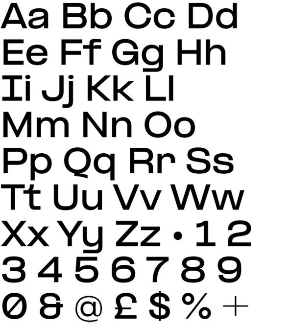
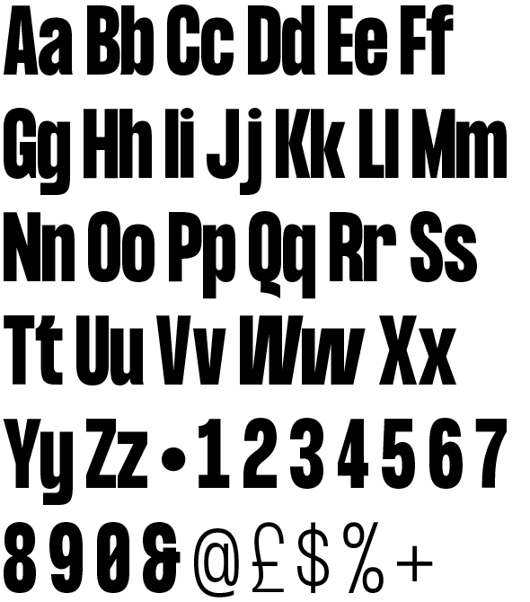
Alternative display font
Formula Condensed
Usage
Subheadlines
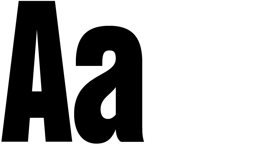
Condensed fonts can give a sleek look to brands, especially when used alternatively on titles.
Brand
Mirta Rotondo
Direction & Strategy
Luca Bergeretti-Cavion
Brand Lead
Philip Likos-Corbett
Brand Narrative
Creative Leads
Joe Landy
Motion, video & blog
Alvaro Sanchez
Editorial, digital ads &
sales enablement
Production
Brand team
Pasquale Morelli, Alessandro Fasano
Creative team
Ilaria Abondanti, May Miuriuk,
Giorgio Tonella
All the people below
made it happen too
